Transparent Black Paper is a special paper that offers a unique surface for creative design. Using Transparent Black Paper allows you to create bold designs, as colors, metallics, and whites stand out vividly against the dark background. Many artists and designers choose this special paper to achieve strong visual effects.
The market for specialty paper, including Transparent Black Paper and other special paper types, is expanding rapidly. It is projected to reach $68.9 billion by 2030, with an annual growth rate of about 5.3%. Industries such as packaging, printing, and labeling are driving this growth in the special paper market.
Key Takeaways
Transparent Black Paper helps make strong designs. Bright colors and metallics pop on its dark background.
Layering can make your art look deeper. Use opaque colors to make things bright. Use transparent colors for a softer look.
Try your art tools on scrap paper first. This helps you not make mistakes. It also helps you get the look you want.
Pick the best way to print. Screen printing and foil stamping are good for clear designs on black paper.
Try not to make common design mistakes. Check your color settings. Save your files in the right format for the best print quality.
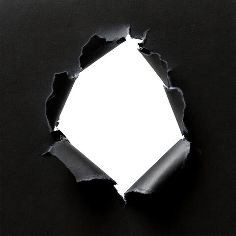
Transparent Black Paper Special Paper

Image Source: pexels
Unique Canvas for Design
Transparent black paper special paper is not like regular black or clear paper. It has a dark look but you can still see through it. The surface feels smooth when you touch it. This paper lets you try new design ideas that normal paper cannot do. When you use it, your artwork looks different. The dark background works like a stage. Bright colors and vibrant shades show up very clearly.
Many artists and designers pick transparent black paper special paper. They like how it makes their art stand out. You can use lots of art tools on this paper. The table below shows what happens with different materials:
| Media Type | Effect on Black Paper |
| Charcoal | Absorbs light, creating depth and contrast |
| Graphite | Lighter than charcoal, offers different optical effects |
| Opaque Colors | Appear brighter and more intense on black |
| Transparent Colors | Deadened appearance when applied on black |
| Compressed Charcoal | Darker than the paper, creates a middle value contrast |
If you use opaque paints or pencils, the colors look brighter. Transparent colors seem softer and less bold. This gives you more control over your art. You can put layers on top of each other. This makes your work look deeper and more interesting. Layering is great for projects that need a strong or bold look.
Visual Impact and Contrast
Transparent black paper special paper helps you make designs that stand out. The dark, see-through surface makes whites and shiny colors pop. You can use this to make your work get noticed. For example, if you make invitations or packages, this paper helps your message show up.
Contrast is important with transparent black paper special paper. You can mix light and dark parts to make your art dramatic. If you use metallic inks or white gel pens, your design looks even cooler. This helps you show off the best parts and lead people’s eyes.
Tip: Try using layers of opaque and shiny colors for a glowing look. This works for art and graphic design.
Designers sometimes have problems with transparent black paper special paper. Some people find it hard to balance see-through and strong colors. Others worry about how colors will look. The chart below shows common worries about transparency in creative work:
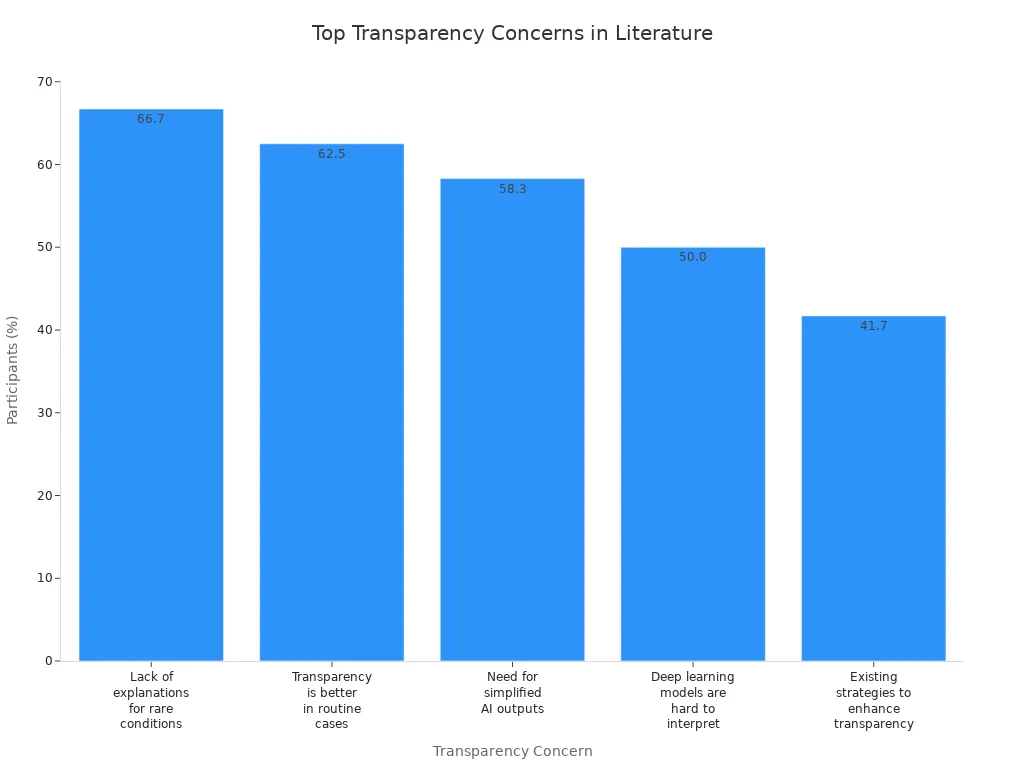
You can fix these problems by testing your art tools first. This helps you avoid mistakes and get the look you want. Using transparent black paper special paper lets you try new ideas and make bold art.
Design Possibilities
Artistic Techniques
You can create captivating artwork on transparent black paper by using a mix of traditional and modern art tools. Colored pencils and soft pastels work well for adding vibrant colors and bold typography. When you start, try layering lighter tones first. This method lets you build up mid tones and colors while leaving some of the black paper visible for shadows. The result is a strong visual effect.
Artists often use a glazing technique. You apply a layer of white pencil before adding other colors. This step makes bright colors stand out even more. Always test your colors on a scrap piece of black paper. This helps you see how the colors will look before you add them to your main artwork. If you want to keep the texture and prevent smudging, use a workable fixative before adding final highlights.
Die-cutting is another technique you can try. It lets you cut out shapes or letters, which adds depth and interest to your design. You can combine these methods to make your artwork unique and visually striking.
Tip: Use white ink or light tones to enhance the glow effect. Avoid heavy dark colors, as they can block the glow and reduce the visual impact.
Creative Applications
Transparent black paper opens up many creative uses. You can design packaging that stands out on the shelf. Invitations made with this special paper look elegant and modern. Many brands use it for labels and branding to create a bold, memorable look. Art prints on this paper show off vibrant colors and bright colors, making each piece pop.
For the best results, put white ink layers behind your design elements. This step blocks out the background and makes your typography and artwork glow. Test print your designs on sample materials to see how transparent inks blend with the paper. Adjust your colors as needed to get the most dramatic visual effect.
You can leave some areas clear or semi-transparent. This trick maximizes the glowing effect and draws attention to your bold typography or design details. When you use these tips, your designs will have a strong visual presence and leave a lasting impression.
Printing on Black Paper
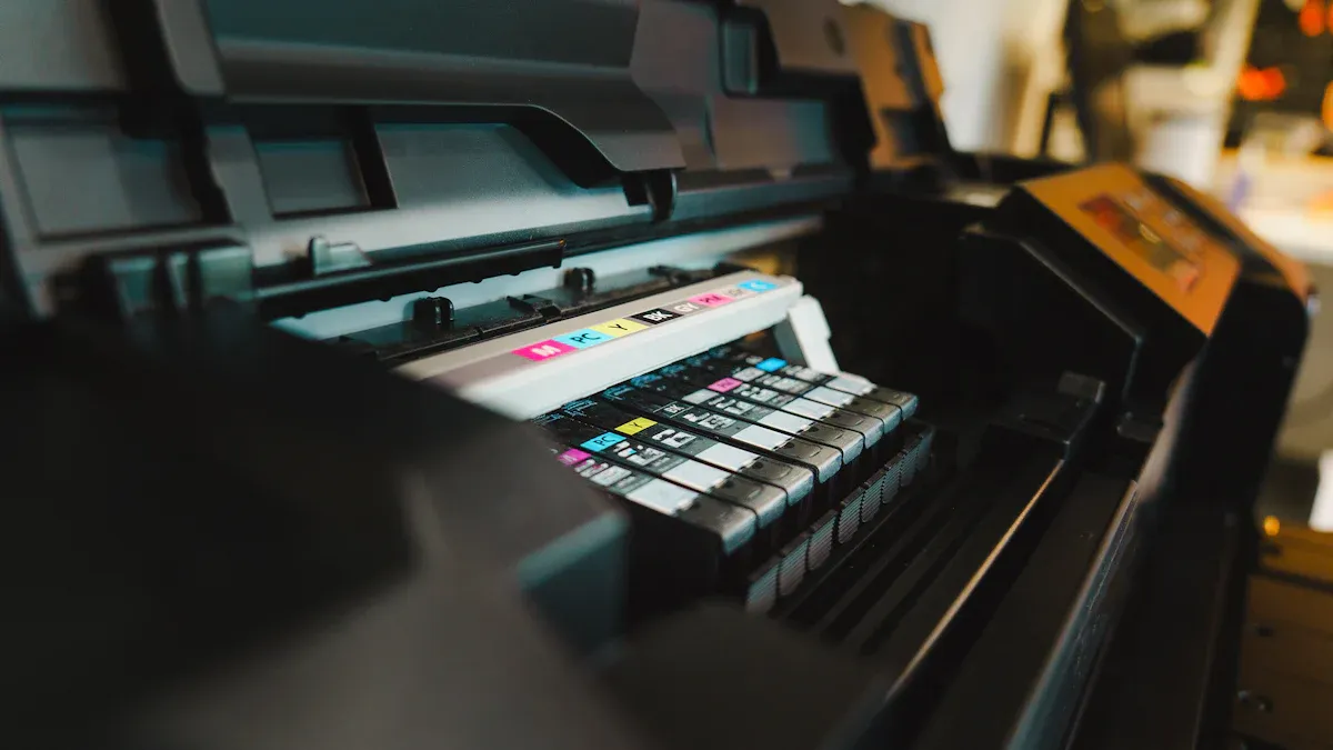
Image Source: unsplash
Compatible Methods
You can make clear designs on black paper with special printing. Screen printing works well because it uses thick inks. Metallic and white inks show up bright on the dark paper. Foil stamping adds a shiny look that grabs attention. UV printing uses special light to dry inks fast. This helps you get sharp lines and bright colors.
Some people have problems printing on black paper. Sometimes, see-through images look like they have black frames. This can mess up your design. You can fix this by using a color-managed process. Save your files as PDF before printing. Use PDF 1.4 or PDF X-4 formats. These steps help you avoid unwanted borders and keep your art neat.
Tip: Test your printing method on a sample piece first. This helps you find problems early and get good results.
Ink and Material Choices
Pick special inks that cover well and last long on black paper. White inks are best for bold designs. Kuretake Comic White Ink and Copic Opaque White are very bright. Deleter White 2 and IC Comic Art White do not smudge or fade. J. Herbin Dip Pen Calligraphy Ink looks smooth and fancy. Dr. Ph. Martin's Pen-White Ink stays thick and bright.
Metallic inks make your prints look rich and shiny. They reflect light and glow, especially with colored edge painting. Colored edge painting makes the edges of your prints stand out more.
To help your prints last, use good materials and coatings. The table below shows some choices for high-quality prints:
| Material/Coating | Description |
| Pigment-based inks | Last a long time but have fewer colors. |
| Archival paper | Made from cotton, acid-free, and strong. |
| Coated inkjet papers | Give better pictures and keep ink stable with special coatings. |
| Swellable polymer | Holds ink, makes prints brighter, and protects from damage. |
| Microporous coatings | Take in ink fast, stop smears, and dry quickly. |
Note: Special inks and coatings help your prints stay bright and strong for a long time.
Best Practices
Follow these steps to print well on black paper:
Get your artwork ready. Make sure it is all black with a clear background.
Gather your tools. You need a screen frame, black paper, special emulsion, and inks.
Set up your frame and screen. Keep the mesh tight and clean.
Put on the photo emulsion. Spread it evenly and let it dry in the dark.
Burn your image onto the screen. Place your art and shine light to copy the design.
Always test your inks and printing before big projects. This helps you avoid problems like weak colors or smears. Use pigment inks and archival paper to make prints last. Colored edge painting adds a cool finish to your work.
Callout: For great results, pay close attention to each step. Small mistakes can change how your design looks.
Printing on black paper needs careful planning and good materials. With special printing, inks, and coatings, you can make bold prints that last and get noticed.
Real-World Examples
Project Showcases
You can find many creative projects that use transparent black paper for dramatic results. Designers often choose this special paper for premium business cards. The dark, see-through surface makes metallic inks and white text stand out. You see this effect in luxury branding and packaging. Some artists use transparent black paper for art prints. They layer bright colors and metallics to create glowing effects. Invitations printed on this paper look modern and elegant. You notice the difference right away because the colors pop and the design feels unique.
One studio created eye-catching business cards by combining foil stamping with white ink. The cards had a rich texture and a glowing logo. Another project used die-cutting to add depth to packaging. The layered look made the product feel exclusive. These examples show how transparent black paper can help you make designs that people remember.
Tip: Try mixing printing techniques like foil stamping and UV printing. You can achieve sharp lines and bright highlights.
Lessons Learned
When you work with transparent black paper, you need to avoid common mistakes. Many designers confuse rich black with plain black in design software. This can lead to poor print quality. You should check your color settings before you print. New users often do not realize that black in digital formats may look different in print.
Here are some mistakes you should watch out for:
Using only 100% black in your design may result in a dull look. You can use CMYK values to make the black deeper.
Saving your files in the wrong format can affect print quality. Always save as .tif for the best results.
Placing a rich black image into a picture box and setting the backdrop as black can cause unexpected results.
| Mistake | Explanation |
| Using only 100% black | This may result in a less rich black; using CMYK values can enhance depth. |
| Not saving as .tif | Saving in the correct format is crucial for achieving desired print quality. |
You learn that testing your design and printing methods helps you avoid problems. Always check your colors and file formats before starting a big project. You get better results and your designs look more professional.
Transparent black paper helps your designs look bold and different. You can use bright colors, metallics, and whites for strong effects. Try many art and printing ways to see what works best for you. Designers share these helpful tips:
Change printer settings for transparency so it does not smudge.
Be gentle with the paper so it does not crease.
Use sharp tools to make neat cuts.
Try new methods for fun and creative projects.
Use this special paper to find new ways to make cool designs people remember.
FAQ
What makes transparent black paper different from metallic paper?
Transparent black paper is dark and see-through. Metallic paper is shiny and reflects light. You use metallic paper for a shiny look. Both papers help you make cool metallic effects.
Can I use metallic inks on transparent black paper?
You can use metallic inks on transparent black paper. Metallic inks look shiny and bright. They make your designs stand out. Designers use metallic inks to make art look richer. These inks work well on both types of paper.
How do I achieve the best metallic effects on black paper?
Use good metallic inks and test them first. Layer metallic inks to make them brighter. Metallic paper gives extra shine. Mix metallic inks with white ink for more contrast. This way, your metallic designs look their best.
What printing methods work best for metallic designs?
Screen printing and foil stamping work well for metallic designs. These methods give you sharp lines and bold effects. UV printing also makes metallic details clear. Metallic paper adds even more shine. These ways help you make eye-catching designs.
Why do designers choose metallic paper for dramatic visual impact?
Designers like metallic paper because it shines and looks deep. It reflects light and makes colors brighter. Metallic paper helps designs stand out. It makes art look richer and grabs attention. Many brands use it for packaging and invitations.


