When you pick a paper shade, you change how colors on paper look and feel. The color you choose can make a design stand out or appear dull. Many people utilize color theory to achieve better results. In one study, a group employed color methods and performed 11% better on their projects. You may notice that the right color scheme captures attention and enhances your message.
| Group Type | Performance Increase | Probability Error |
| Color Method Group | 11% | 2% |
| Control Group | 2% | 2% |
More than half of people prefer to use color-coding for important items. If you understand the color wheel, color harmony, and primary colors, you create a stronger visual effect on paper.
Key Takeaways
Picking the right paper color can make your design stand out. Try colors on real paper to see how they look together.
Learn basic color theory, like the color wheel and color harmony. This helps you make nice color mixes in your projects.
Use CMYK color mode when you print to keep colors bright and correct. Change RGB files to CMYK before you print them.
Putting colored papers on top of each other makes your crafts look deeper and more interesting. Try using different heights and textures for a better look.
Think about how colors make people feel. Warm colors give energy, and cool colors feel calm. Pick colors that fit your project's mood.
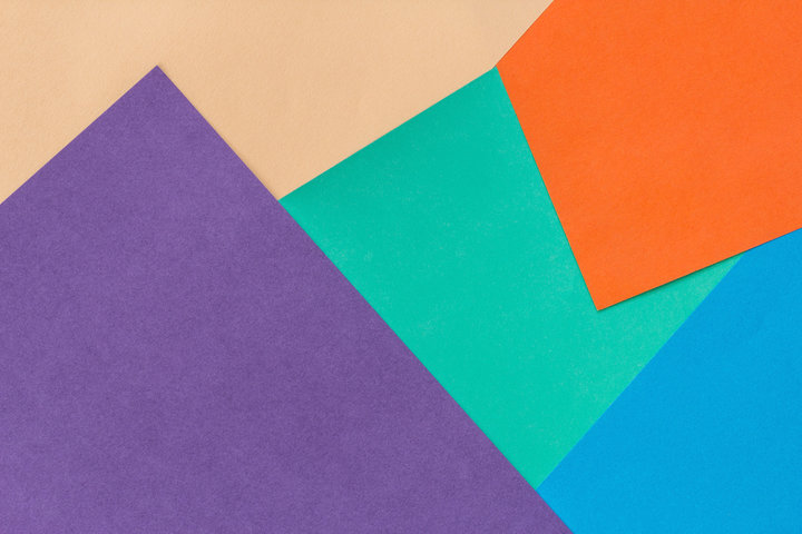
Color Theory on Paper
Understanding color theory helps you make better choices when working with paper. The color wheel is a tool that shows how colors relate to each other. You see primary colors like red, blue, and yellow on the wheel. When you mix these, you get secondary colors such as green, orange, and purple. The color wheel also helps you find complementary colors, which sit across from each other and create strong contrast in your color scheme.
| Principle | Description |
| Color Wheel | Organizes colors into primary, secondary, and tertiary groups, making it easier to plan a color scheme. |
| Color Properties | Includes hue, value, and intensity, which change how you see and use colors in your designs. |
| Color Harmony | Uses schemes like monochromatic, analogous, and complementary to make your work visually appealing. |
| Color Temperature | Groups colors as warm or cool, which affects the mood of your project. |
Hue, Saturation, and Brightness
You can describe every color by its hue, saturation, and brightness. Hue means the basic type of color, like red or blue. Saturation shows how pure or intense the color is. Brightness tells you how light or dark the color appears. When you print on colored paper, these properties change. For example, a bright color may look dull on a dark paper shade. You need to think about how your chosen color scheme will interact with the paper’s color.
Color Models: RGB and CMYK
You use different color models for digital and print projects. RGB stands for Red, Green, and Blue. This model works for screens and uses light to make colors. RGB colors look bright and vibrant because more light creates more color. CMYK stands for Cyan, Magenta, Yellow, and Black. Printers use this model because it mixes ink on paper. CMYK colors often look less vibrant than RGB because ink absorbs light instead of adding it.
RGB is best for digital screens.
CMYK is the standard for printing on paper.
You should convert RGB files to CMYK before printing to keep your colors consistent.
CMYK cannot show as many colors as RGB, so some colors may look different in print.
Tip: Always check your color scheme on the actual paper you plan to use. The color wheel and color theory help you predict how colors will look, but paper shade can still change the final visual effect.
Printing and Colors on Paper
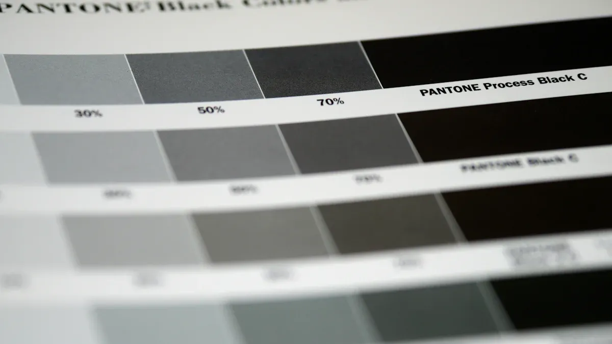
Image Source: pexels
Ink and Paper Interactions
When you print colors, paper and ink both matter. The same blue ink can look different on white, cream, or gray paper. You might think you see many blues, but it is the paper color that tricks your eyes. Transparent inks let the paper color show through. Light goes through the ink and bounces off the paper. This can make your colors look brighter or duller.
Glossy finishes make colors look bright and sharp. Pictures seem brighter and details pop out.
Matte finishes give a soft, gentle look. Colors look calm and natural, which is good for faces or nature.
Glossy paper bounces more light, but matte paper soaks it up. This changes how you see the picture.
Picking the right paper color helps your pictures look better. For example, printing faces on cream paper can make them look yellow. This may not match what you want. Always test your colors on the paper you will use.
Common Printing Issues
Printing with many colors can cause problems. You should watch for these common issues:
| Issue | Explanation |
| Incorrect color profiles | RGB colors need to change to CMYK before printing, or colors may look wrong. |
| Low-resolution images | Low resolution makes printed pictures look blurry or unclear. |
| Improper paper settings | Wrong paper settings can cause uneven ink and color changes. |
| Uneven ink coverage | Ink can go on unevenly, making some spots look faded. |
| RGB Color Mode vs. CMYK Mode | Using RGB instead of CMYK can make colors look strange. |
The paper type also changes how colors look. Synthetic paper does not soak up ink, so colors stay on top and look clear. Recycled paper soaks up ink in a messy way, so colors can look faded or spotty. Bulky paper soaks up ink well and spreads it evenly, but its thick feel can change how you see the colors.
| Paper Type | Ink Absorption Characteristics | Color Fidelity Observations | Surface Properties |
| Synthetic Paper | No soaking; air cannot pass through | Water sticks to the surface | Very smooth; ink does not stick well |
| Recycled Paper | Ink soaks in unevenly | Water rolls off the surface | A bit rough; ink soaks in differently |
| Bulky Paper | Ink soaks in evenly | Water rolls off easily | Thick and full of holes; soaks up more ink |
Professional Tips
You can get the right colors by following some smart steps. Print experts make special color profiles for each paper. They test color charts and color ramps to see how colors change. They use tools to measure printed colors and check them against standard colors. This helps them make custom ICC profiles for each paper.
Tip: Always change your files from RGB to CMYK before you print. This helps you keep your colors the same and stops color changes.
Pick your paper finish based on your project. Glossy finishes are good for photos and designs with lots of bright colors. Matte finishes are better for projects that need a soft, natural look. Remember, color temperature can change the mood. Warm colors feel lively, and cool colors feel calm.
Test your colors on the real paper before printing a lot. This helps you see how your colors work with the paper and finish. When you know how colors act on paper, you can make your work stand out and avoid mistakes.

Crafting and Color Harmony
Choosing Paper Shades
Picking the right paper shades is very important. It helps you make color harmony in crafts. You need to know how colors on paper work together. Palette Scout is a tool that helps you match colors. It uses color theory to help you pick colors that look good together. Palette Scout gives you 180 colors and 8 challenge cards. This makes it easy to try new color ideas.
| Feature | Description |
| Tool Name | Palette Scout |
| Purpose | Helps create harmonious color combinations based on color theory principles. |
| Number of Colors | 180 |
| Challenge Cards | 8 |
Colors can be put into three groups. These are primary, secondary, and tertiary. Mixing colors from these groups helps you make a balanced color scheme. When you pick paper shades, think about the feeling you want. Warm colors like red and orange give energy. Cool colors like blue and green feel calm. Color temperature helps set the mood for your craft.
Tip: Test your colors on small paper pieces first. This lets you see how colors look together. It helps you make sure your colors match well.
Layering and Combining Colors
Layering colored papers adds depth and texture. You can overlap paper, photos, or cutouts. This makes your craft look more interesting. It also helps guide the viewer’s eyes to important spots.
Layering gives your project dimension and makes it look better.
Decoupage and scrapbooking use layering to show key parts.
Overlapping things can make your design look neat and professional.
To get good results, follow these steps:
Color Coordination: Pick colors that go well together.
Varying Heights: Use adhesives to make layers stand out.
Balance: Spread things out so your project does not look messy.
Watch how colors mix when you layer them. Some colors blend nicely, but others might clash. Step back and look at your craft from far away. This helps you check for balance and harmony.
Impactful Color Pairings
Using many paper colors needs planning. You want to avoid making your craft look messy. Try these ways to keep color harmony:
Monochromatic: Use shades of one color for unity.
Analogous: Pick colors next to each other on the color wheel. These colors, like blue and green, feel calm.
Complementary: Use colors across from each other, like red and green. This gives strong contrast and energy.
Split-Complementary: Use one color and its two neighbors for more choices.
Triadic: Pick three colors spaced out on the wheel for balance.
Tetradic: Use two pairs of opposite colors for a rich look. Make sure to keep balance.
Incorporate Texture and Pattern Thoughtfully: Add texture for depth but do not let it clash.
Consciously Seek Balance: Check how heavy each part looks.
Introduce Variety Purposefully: Add different things to stop your craft from looking boring.
Step Back, Evaluate, and Get Feedback: Look at your work often to see if it looks good.
Iterate and Refine Relentlessly: Keep changing your design until it feels right.
Some color pairs are good for getting attention or setting a mood. Red grabs attention and feels emotional. But red does not always stand out in every setting. In neutral places, red may not work as well.
Note: When you test color mixes, look at how strong the colors are. Check how far apart the hues are on the color wheel. Look at the difference between light and dark. Bright colors make things exciting. Big contrasts make things stand out more.
| Method | Effect on Stimulation |
| Overall color intensity | Bright colors excite more; dull colors excite less. |
| Hue distance in the color wheel | Colors far apart excite more; close colors excite less. |
| Light-dark contrast | Big contrast excites more; small contrast excites less. |
You can get color harmony by following these tips. Always test your colors on paper before you finish your craft. This helps your colors work together. It makes your project look great and helps people remember it.

Visual Impact and Color Psychology
Emotional Effects of Color
You feel different things when you see colors on paper. Color psychology says colors can change your mood and choices. A study found color helps people remember brands better. Using familiar colors helps people remember your message. Gold makes you think of luxury. Blue feels calm and safe. Fast food places use red and yellow for excitement. You should think about color temperature too. Warm colors like red and orange make you feel lively. Cool colors like blue and green help you relax. How you feel about colors depends on your culture and background. In some places, white means purity. In Japan, white means mourning.
Colors can make people feel strong emotions.
Color temperature changes how you feel about pictures.
Culture changes how people see colors.
Effective Use in Design
You can use colors to guide people’s eyes. Colors help your design stand out. Many shoppers say colors and pictures matter when they shop. Pick colors that fit your message and audience. Blue and green work well for healthcare. They feel safe. Gold and black are good for luxury. They look fancy. You need to balance colors so things are clear. Make sure your colors have enough contrast. This helps people read your text. Use online tools to check if your colors are easy to see. This helps people with color blindness too.
| Color Scheme | Best Use Case | Emotional Response |
| Blue & Green | Healthcare | Calm, Trust |
| Gold & Black | Luxury Brands | Elegant, Exclusive |
| Red & Yellow | Fast Food | Energetic, Exciting |
Tip: Test your colors on paper before you print or craft. This helps you see how they really look.
Mistakes to Avoid
Problems happen if you do not plan your colors. Do not use colors that are too bright all at once. Lower the saturation or brightness for better results. Make sure your colors have enough contrast. This helps people read and understand your work. Always use CMYK mode for printing. RGB colors can look dull when printed. Do not use too much cyan, magenta, yellow, or black. Your colors may look muddy. Set your black carefully for text and backgrounds. Pick a rich black for sharp text. Remember, culture matters. Pepsi lost sales in Southeast Asia because light blue meant death. White means purity in some places. In Japan, white means death. Red means danger in the West. In China, red means luck.
Do not use too much bright color or poor contrast.
Always check your colors for accessibility.
Think about culture before you pick colors.
You can improve your printing and crafting projects by understanding color theory. The color wheel helps you choose colors that work well together. When you use strong contrast between paper and ink, you make text easier to read. Try different paper colors to boost memory and make your designs more fun. You can use colored paper for flashcards, posters, or visual cues. Before you start, think about your project goals and your audience. Test your color choices to see which ones create the best impact.
FAQ
What happens if you print on colored paper?
You change how colors look when you print on colored paper. Ink mixes with the paper shade. Some colors may appear dull or different. Always test your design before printing many copies.
How do you pick the best paper color for crafts?
You start by thinking about your project’s mood. Warm colors feel lively. Cool colors feel calm. Try matching colors using a color wheel. Test small samples to see how they look together.
Why do printed colors sometimes look different from your screen?
Screens use RGB colors. Printers use CMYK colors. Some colors do not match exactly. Paper type and finish also change how colors appear. You should always preview your design before printing.
Can you use colored paper for text-heavy projects?
You can use colored paper for text, but choose light shades. Dark paper makes reading hard. Use high-contrast ink, like black on yellow. Check readability before printing many pages.


